Orchestrating the Genesis of a New-age Ready-to-Eat Food Brand - Oyalo
Shaping Oyalo’s Debut in Redefining Frozen Food Excellence
Oyalo, the frozen food subsidiary (formerly) of Hatsun – one of India’s largest private dairies, marked its debut across Hatsun Distribution Centers. The challenge lay in Hatsun’s foray into frozen foods, leveraging its robust dairy cold chain distribution. Launching a brand for ready-to-eat offerings, into the skepticism of Indian consumers accustomed to hot meals, required a strategic approach starting right from the brand name, the voice, the design language, and more. Our goal was to create a clutter-breaking identity for this emerging brand, making its mark on the audience.
What We Did For the Brand
- Brand Identity & Design
- Brand Communication & Collateral Design
- Digital Assets Design
- Brand Packaging Design
Branding
- One MG was tasked with creating a brand name for Oyalo which should, in line with Hatsun’s naming ideology, be catchy and easy to remember while having no meaning in 5 Indian and international languages.
- Focus Group Discussions were conducted to the gauge the popularity of the brand names we came up with where Oyalo emerged a clear winner.
- The brand identity of Oyalo was depicted through a leaf illustrated in a steamy silhouette, forming a wing, suggestive of the main 3 aspects of Oyalo – Hot, Quick, Vegetarian Food.
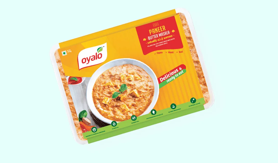
Packaging
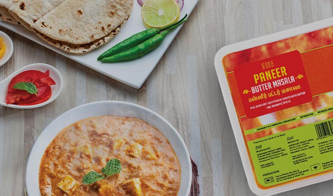
- The packaging for Oyalo was designed for multiple variants, their frozen snacks and chilled ready to eat food. Multiple factors had to be kept in mind while designing it:
- Attention grabbing graphics
- The amount of storage space it occupied
- Overall cost and ease of manufacturing the packaging
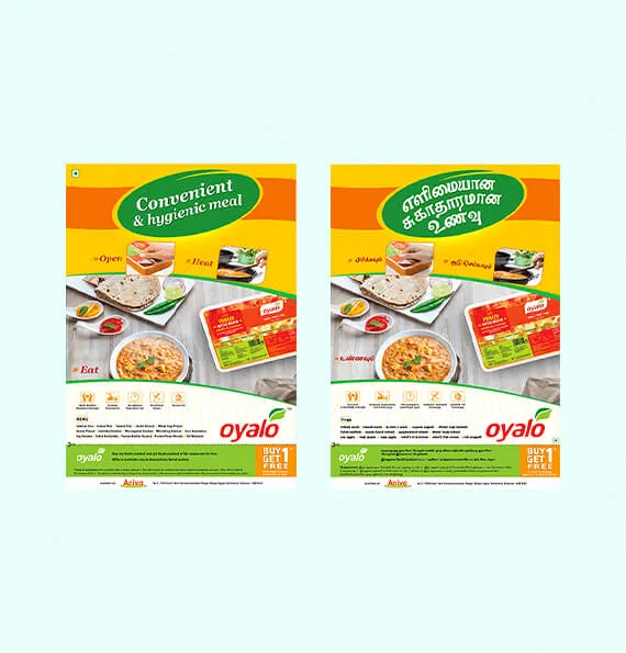
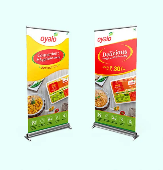
BTL Collaterals
- The go – to – market campaign for Oyalo began with multiple BTL activations across stores, apartments, residential colonies and public parks.
- Executed as a bilingual campaign (Tamil and English) to appeal to both the masses and classes, the communication was largely centred around convenience and health.